

User experience is one of the biggest contributors to adoption, understanding, and platform success. And, with a system like Salesforce, that makes it super easy to add so much data, detail, and functionality — finding the line between clarity and clutter, while still maximizing the amount of actionable data in your org can feel like a tightrope walk. Once you add in non-admin users of various skillsets and expectations when it comes to their daily processes and ideal system/info complexity, anything you can do as an admin to improve UX and minimize mis-clicks is a blessing.
In today’s post, we’ll talk about one of my favorite features in Salesforce Lightning — the ability to add or remove components and elements from the screen, based on context! Let’s dive in.
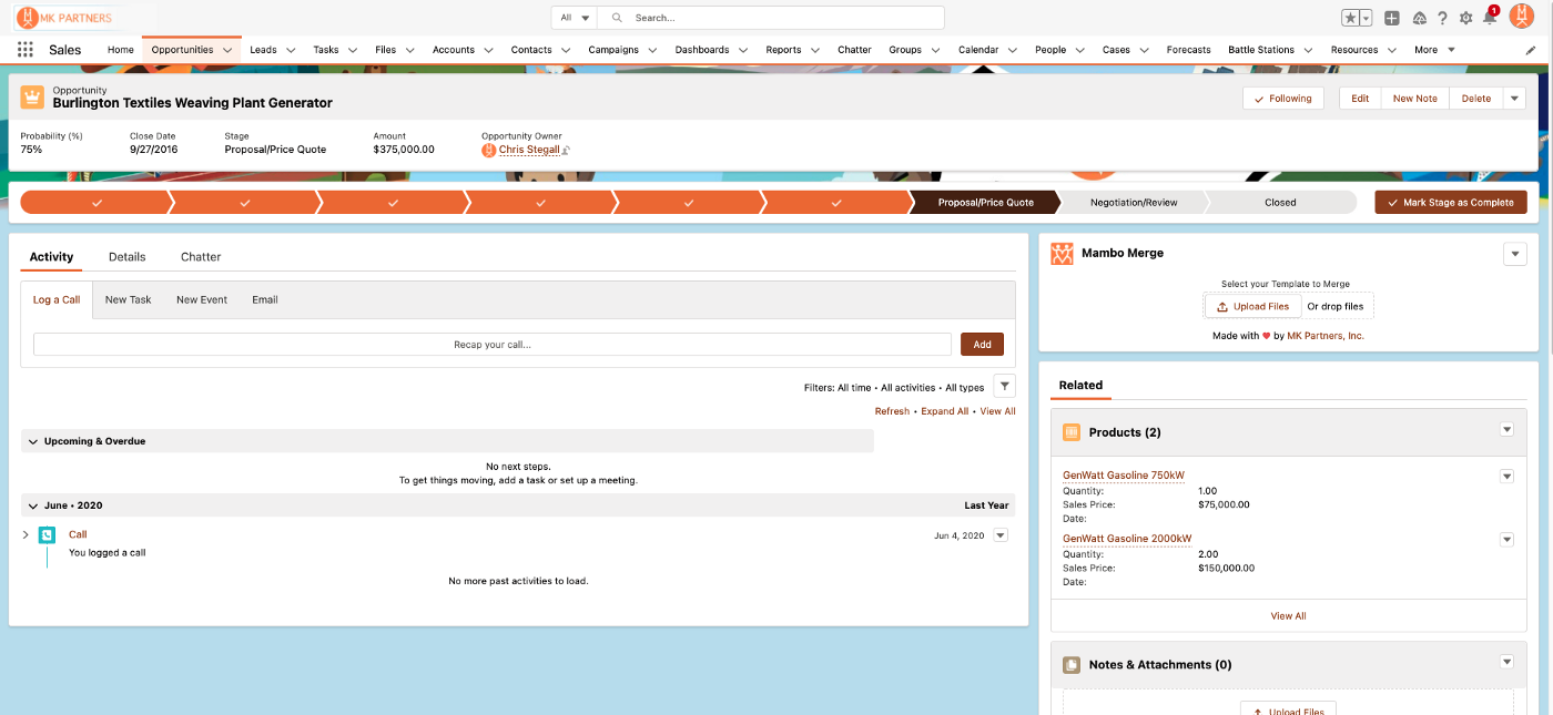
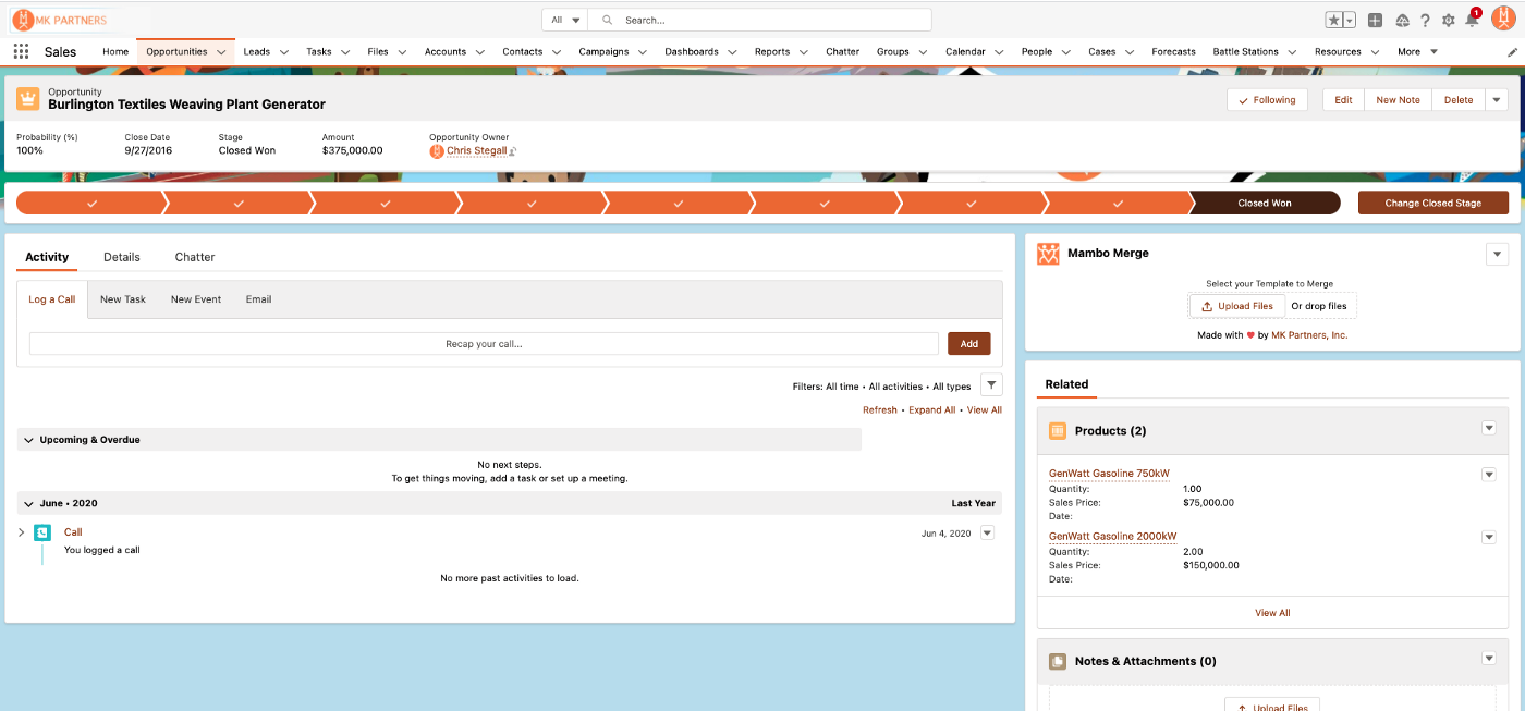
In this example I have a component, Mambo Merge, that does document generation based on the data in our org. When an Opportunity is at the “Proposal/Price Quote” stage, it’s used to generate a quote to send to the prospect for review then, when an opportunity is “Closed Won”, we use Mambo Merge to generate an order confirmation/summary.
This setup involves two instances of the component on the page layout then, one for the quote and one for the summary. You can see both components on the right hand side of the layout below.
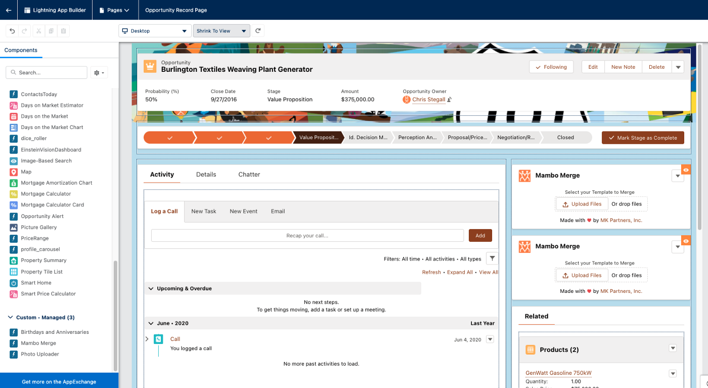
But, if we just left both components on the screen all the time, at 90% of the Opportunity stages, they’d be irrelevant and, when it finally came time to generate one of the documents, there’d be a 50/50 chance of a user selecting the wrong one. (And, as admins know — if you give most users a 50/50 chance, you’ll get mis-clicks more like 75% of the time). So here’s the key to simplifying your screens.
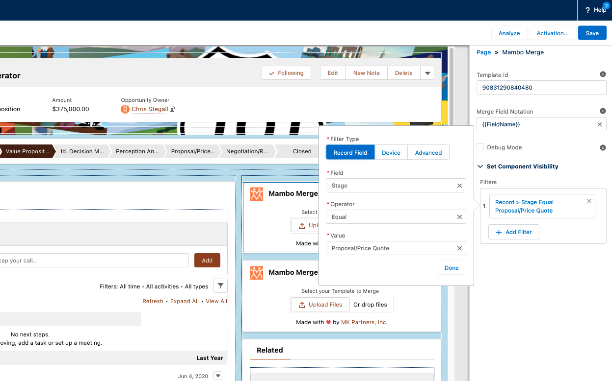
First, click on the component you’d like to trigger contextually and then select “Set Component Visibility”. From there you can specify when the component should appear based on any number of relevant fields/contexts. In this case, we’ll select the “stage” and “Proposal/Price Quote” for the first instance:
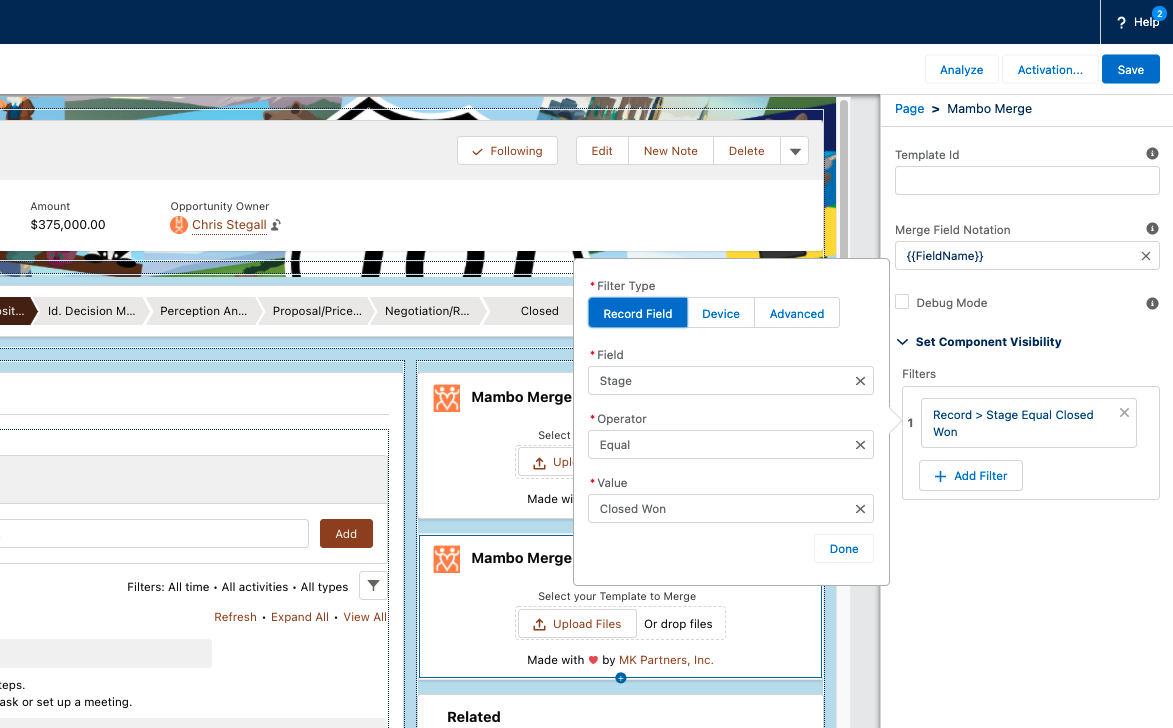
And for the second instance, “stage” and “Closed — Won”:
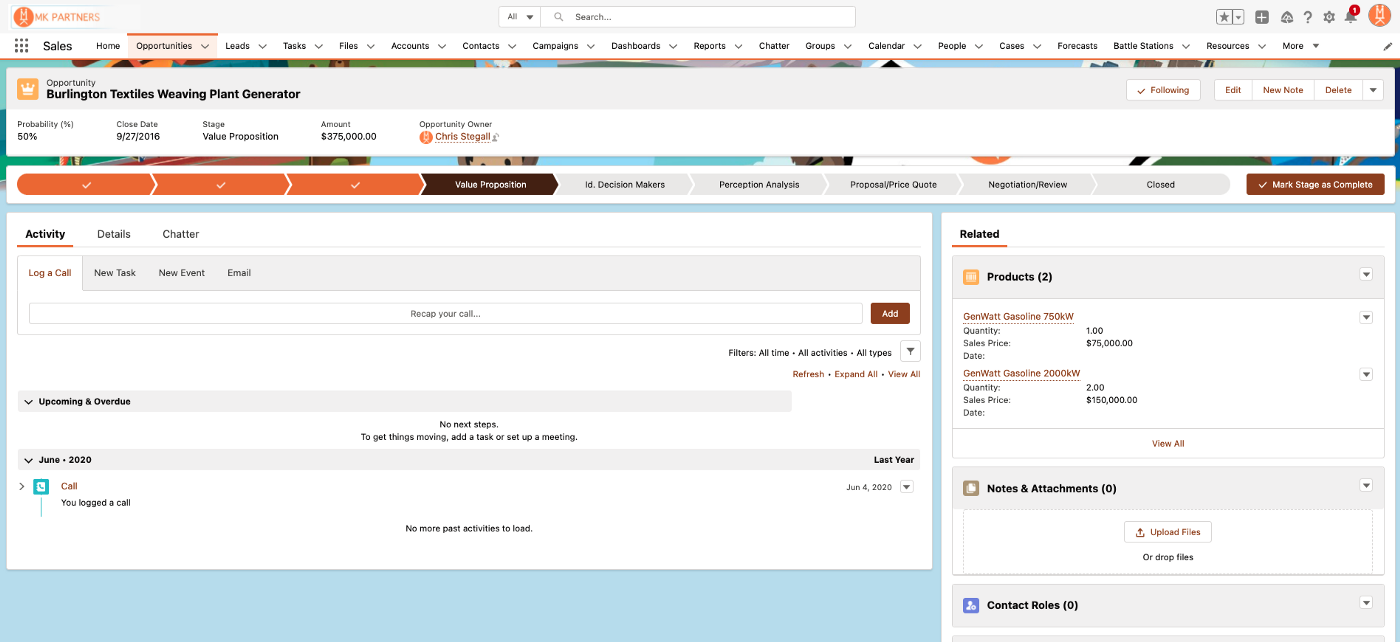
Be sure to save your layout, make sure you have it activated, and you’re all set! Now, when you’re users are on, say, the “Value Proposition” stage of the opportunity, the components are conveniently absent from the layout:
And when they get to “Proposal/Price Quote”, the relevant instance of Mambo Merge appears!
And ditto for once that Opportunity gets to “Closed — Won”!
And, because we put both instances in the same spot on the screen, users don’t even need to learn two different behaviors — they know where to click when the business process calls for a document, and our context-dependent components take care of making sure to generate the relevant one. So users can focus on doing their work, not stress about trying to find the right button at each stage!
And again, this is built-in Lightning functionality, so it works for everything you might want on a layout — related data, details, case or contact info — anything that you might not always want taking up screen real estate, but if it’s user-relevant at some point in the process, now you can limit it to just those specific instances! It’s a perfect tool for maximizing UX simplicity and usability, without sacrificing the details or data your organization relies on to be successful.
So give it a shot in your processes today — your users will thank you. And, as always, if you need a hand getting set up, would like a more personalized look at opportunities to improve your Salesforce org, or need a hand taking your next project from “back of the napkin” to “live in production”, drop us a line! We’re always happy to help.
Until next time, keep working hard, smart, and happy. We’ll see you in the cloud.